Hotspot Overlay
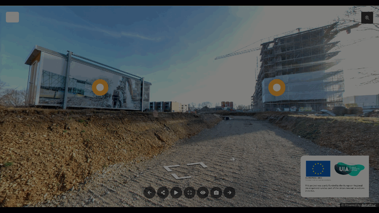
The Hotspot is an active button over an active panorama with a popup window that displays additional details about an area or object in a virtual tour. You can attach a piece of content that visitors can click to get additional information about an object while on a virtual tour.
Why Gothru Overlay hotspots
- Gothru Overlay hotspot is very interactive and highly customizable. You can choose where you want the hotspot to appear, the content it takes, and the details you want it to give.
- Hotspots provide better experience and information for visitors. The visitors simply click on the hotspot to get more detailed information about a product or service like they are currently standing in the building.
- Increase the amount of interaction and information access with more potential customers for your business.
- There are various content types you can add to the popup making your tour more attractive and informative. Berlin hotspot now supports nine content types -- simple, HTML, Image-left, Image-top, video-top, image, video, audio, iframe, pano-link, link, and title.
How to work with the tools under the hotspot plugin settings.
The tools under the hotspot settings are made up of five sections: Content, Hotspot, Appearance, Colors, and Styles.

1) Content
The popup content section is where you can add content to the popup. You can embed various content types -- simple, HTML, Image-left, Image-top, video-top, image, video, audio, iframe, pano-link, link and title. Click on the content type under the popup content settings to select a content type for the hotspot.
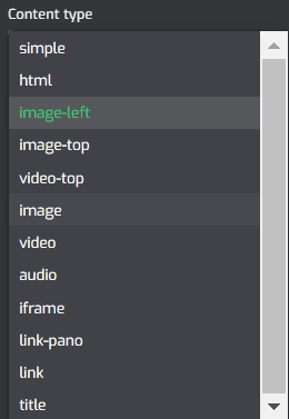
The following is the brief information about the types of content under the popup content section.
Simple
Simple is a content category that includes a title and a short description. With the Simple Content type, you can put briefly the main information to help the visitors better understand the product, without opening a new tab to look for the information.
HTML
HTML content types include HTML code, which can be used to incorporate a webpage and its contents into a virtual tour. The HTML <img> tag will embed an image of a web page that is not only technically inserted into a virtual tour, but also linked to the web pages.
Image-left
It allows you to create a Popup that contains an image/photo with a piece of brief information appended on the right side. Image-left content enables you to showcase a specific area or product details so the visitors will better understand the area or product.
Image-top
Similar to Image-left content, the image-top also allows you to showcase a specific area or product details with a caption appended to the image.
Video-top
It allows you to create a popup that contains a video with a description underneath. In general, visitors simply click on the hotspot to view a Youtube/Vimeo video that has the information related to the product.
Image
Similar to Image-left and image-top content type, the image content also allows you to showcase a specific area or product image but without a caption.
Video
Similar to video-top content, it allows you to create a Popup that contains a video but without a caption. You can insert a Youtube/Vimeo video to the hotspot content that has the information related to the product.
Audio
It allows you to attach an audio file to the hotspot that has the information related to the product. In brief, you can place your product audio into the virtual tour that makes your tour more appealing to consumers.
Iframe
It embeds a webpage on the hotspot using the iframe code. Using Iframe content type, you can embed documents, videos, and interactive media within a virtual tour and the visitors can easily connect to a link that contains information about the product.
Link-pano
Link-pano allows you to join the previous and next panoramas in one tour using a hotspot so at the end your tour visitors can easily move from one area to another only by clicking the hotspot.
Link
This content type can be used to link to an external URL that will be opened when the hotspot is clicked.
Title
If you need to mark an area or object within a panorama without using text or other media, the title content type is ideal. The hotspot title can be set to always show, hide, or show when the hotspot icon is hovered over.
To learn more about hotspot content, please refer to how to work with hotspot content types.
2) Hotspot
The hotspot section determines the main design of the hotspot marker. It is where you can enter the hotspot title, add the hotspot icon, and set up the hotspot configuration.

Hotspot Title
The hotspot title is used to give a title to the hotspot. Click on the hotspot title and type in the text field.

Title Visibility
It sets the title visibility to always shown, mouse hover visible or hidden.

Tags
Tags allow you to add a tag ID to the hotspots. Using the tag ID you can export and import the hotspots content and easily edit or update the content on Google sheet or CSV editors with no need of locating and opening the hotspot one by one. Read How To Export & Import Hotspot Content

Auto Open
It sets the popup content to automatically open when a specific pano loads.

Auto Center
It is used to auto center the active pano when a hotspot is opened.

Replace Marker Image
It changes the entire hotspot icon using a custom SVG image. Slide the toggle then click on the Hotspot Image to upload a new image, or select one that’s already in your Asset Manager.

Marker
You can change the hotspot markers that make the hotspot unique to represent the marked object.

Marker colors
This colors setup modifies the hotspot marker colors. It sets the color combinations so the marker can fit the entire virtual tour.
Marker primary color is used to change the center layer of the marker.
Marker secondary color sets the color of the second layer from the middle of the marker.
Marker third color sets the third layer of the marker.

Marker Size
Marker size allows you to enlarge or adjust the size of the hotspot marker. Move the slider to the right to increase the size of the control bar and to the left to decrease it.

3) Appearance
Under the appearance section, you can set up the style and preview customizations to the hotspot popups such as popup animation and other configurations.
Hover Open
It sets the popup to automatically open when hovering.

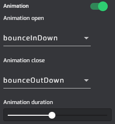
Animation
It adds an animation effect to the hotspot popup entrance and close. Slide the animation toggle then select bouncing, fading, flipping, rotating, sliding, zoom, or other special effects under the animation menu.
Area
It controls the position where the popup is shown up. You can place the control bar in the center or at the side area of your screen.

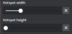
Hotspot width and height
It is used to adjust the width and height of the hotspot popup. Move the slider to the right to increase the width or height.
Margin
Margin adjusts the distance between hotspot content to the end corner of the screen. Slide the slider to set up the popup margin.

Border Radius
Border Radius sets the roundness of the popup corners. Increase the value in each field to make a rounded corner and GoThru Overlay Border Radius will automatically adjust all four corners at once.

Shadow Depth
Shadow depth sets a shadow effect on the hotspot popup.

4) Colors
The colors section allows you to modify the hotspot popup colors. It sets the color combinations so the popup can fit the entire virtual tour. GoThru also supports gradient colors, available in 4 different directional gradients and a circular gradient.
Common colors set the popup colors to connect the colors in the general setting.
Hotspot background color sets the color of the popup background.
Active color changes the colors of the active hotspot.
Text color sets the colors of the text in the popup.
Set this color as a common set color which belongs to the hotspot plugin and determine the default colors choices for other plugins.

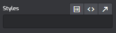
5) Style
Styles at the lower part of the settings allow you to modify the hotspot plugin using CSS code. You can copy and paste your codes here then apply some changes to the plugin.