How to Change the Style of the Hotspot Popup

When you work with the hotspot plugin, the hotspot settings appear on the right panel consisting of three sections - hotspot section, popup section, and popup content section.
This article will be looking at the settings under the Popup Section where you can set up the style and preview customizations of the hotspot popups such as popup animation and others.
Hover Open
It can be used to enable auto-open popup and its content when the user moves the mouse pointer over a hotspot.
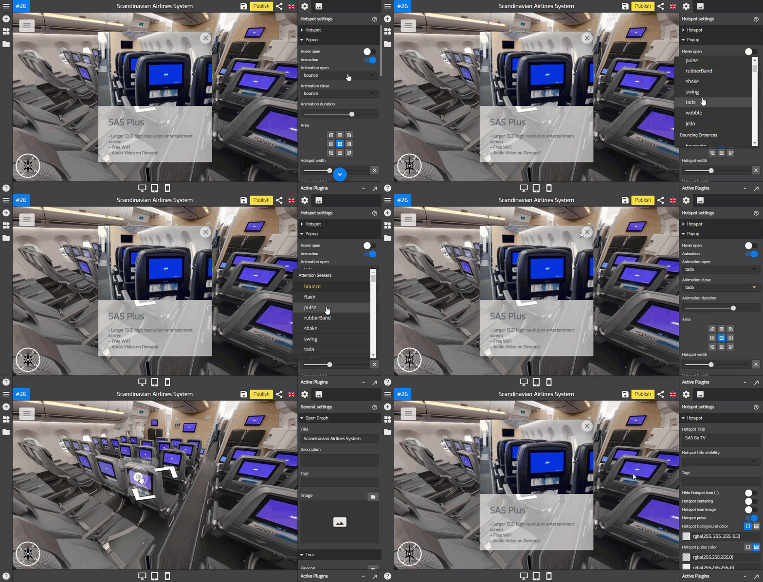
Animation
This function allows you to add an animation effect to the hotspot popup entrance and close. Switch on the animation toggle to enable the animation then select the desired animation such as bouncing, fading, flipping, rotating, sliding, zoom, or other special effects as shown in the following example.

Area
It controls the positions where the hotspot popup appears. You can choose the center, top, bottom, left, or right side of your screen. Defaults to 'center'.
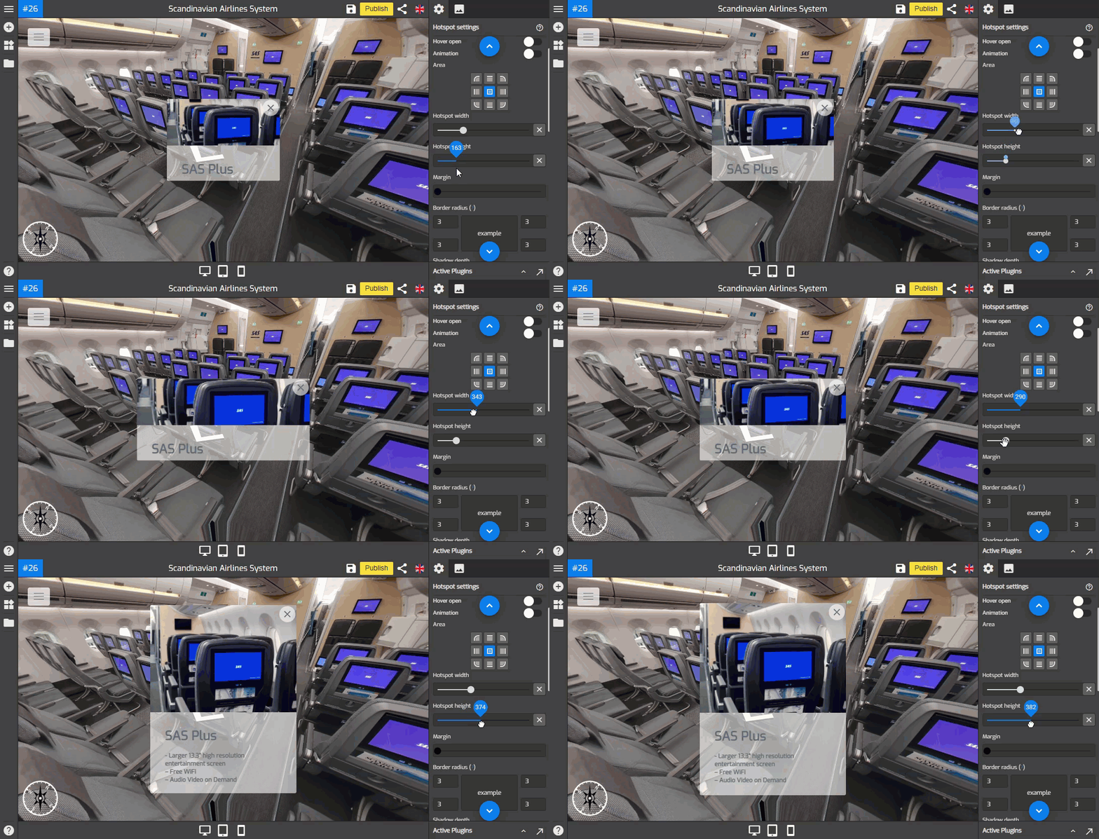
Hotspot Width and Height
You can use Hotspot width and height to adjust the width and height of the hotspot popup. Move the slider to the right to change the width or height until the popup can fit the hotspot media properly.

Margin
Margin used to adjust the distance between hotspot content to the end corner of the screen. Slide the slider to set up the popup margin.
Border Radius
Border Radius sets the roundness of the popup corners. Increase the value in each field to make a rounded corner and GoThru Overlay Border Radius will automatically adjust all four corners at once.
Shadow Depth
Shadow depth sets a shadow effect of the hotspot popup.
Popup Color Settings
You can modify the hotspot popup colors and set the color combinations so the popup can fit the hotspot content properly.
Common color
You can set the menu colors to connect the colors in the general setting using the Common color option. It will duplicate the colors you set in the general setting. Switch on the Toggle of Common color to apply general setting color sets to the hotspot popup as shown in the following example.
Background color
To change the color of the popup background, you can click the Background Color to open its color picker and select the colors you want to use.
Active color
Active color can be used to change the color of the active button on the popup. You can change the color as the following example shows.
Text color
The Text color changes the colors of the text on the popup that works like this example.
Set this color as common
Set this color as common button used to apply and save the color which belongs to the hotspot plugin and will become the default color choices for other plugins including the general setting.
